Chromatic Mastery: The Impact of Pantone in Packaging Design
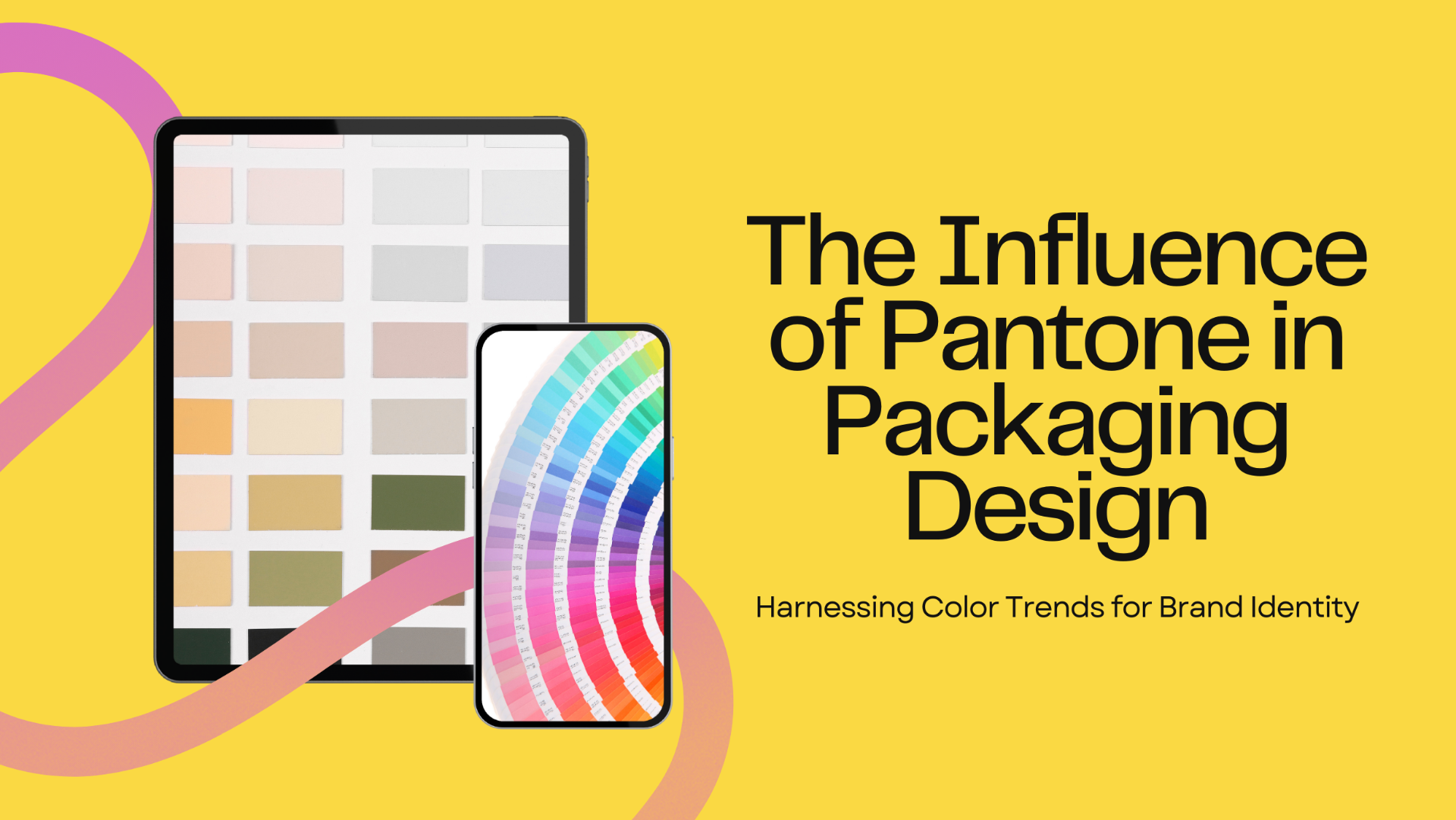
In the dynamic world of design, where every hue and tone holds significance, Pantone stands tall as the beacon of color. Since its inception in 1963, Pantone has not only defined color but has also revolutionized how we perceive and employ it, particularly in packaging design. Let's embark on a journey to explore the profound influence of Pantone in shaping the aesthetics and functionality of packaging across industries.
Universal Color Language:
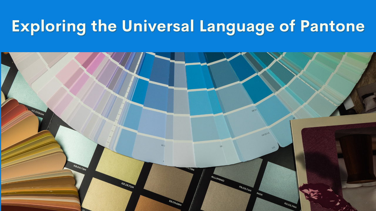
Pantone provides a universal language of color that transcends geographical boundaries and cultural differences. It serves as a bridge between designers, manufacturers, and consumers worldwide, enabling seamless communication and decision-making at every stage of the packaging workflow. With Pantone, designers can articulate their vision with clarity, ensuring that the essence of their brand is captured accurately through color.
Precision and Consistency:
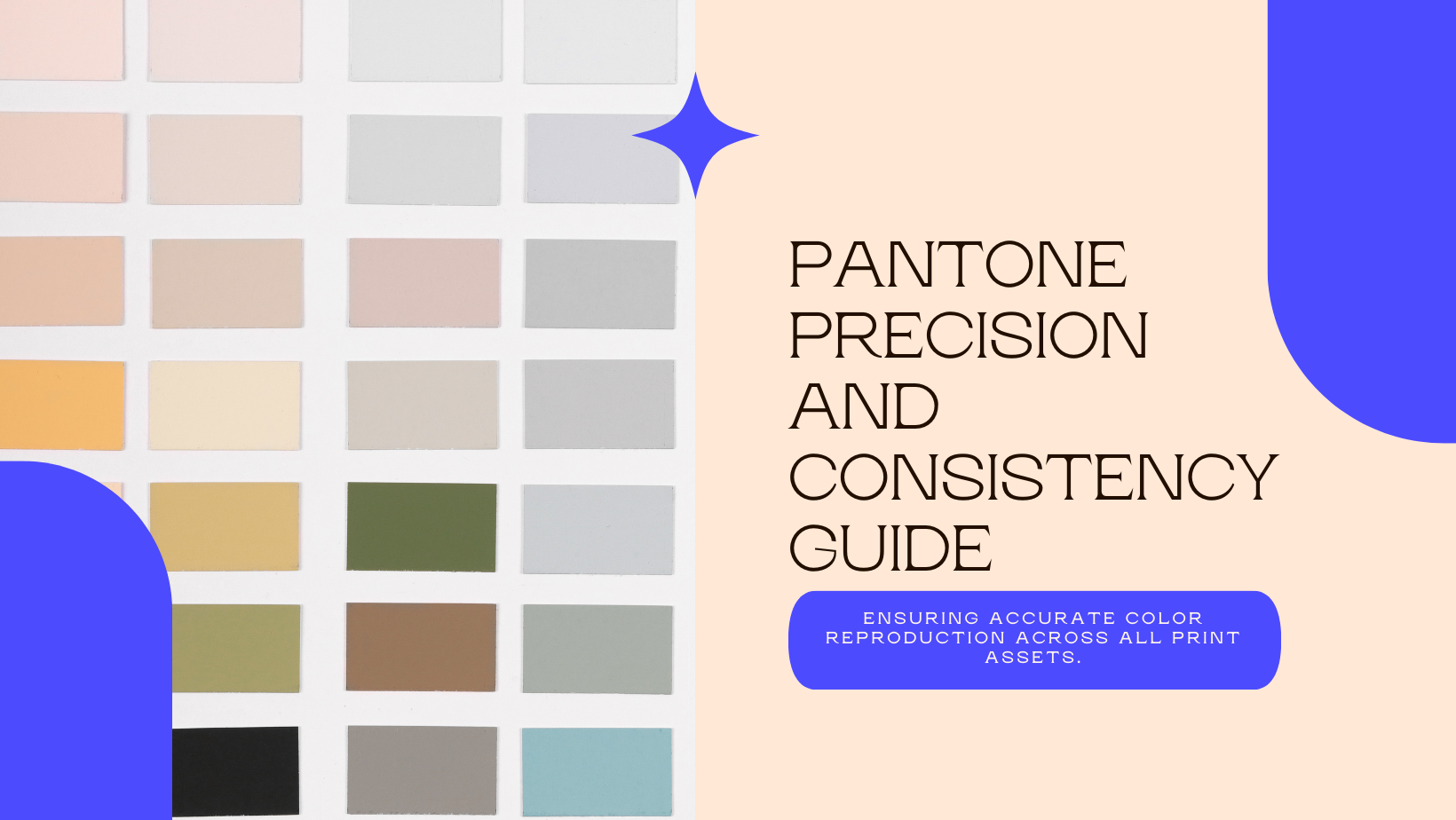
In the realm of packaging, precision is paramount. Pantone's Matching System (PMS) embodies this pursuit of perfection by offering a standardized method for selecting and reproducing colors. Through a proprietary numbering system and chip format, Pantone ensures that designers can achieve consistent, accurate colors across various packaging materials and printing techniques. This level of precision instills confidence in designers, knowing that their creations will be faithfully represented in the final product.
Innovation and Integration:
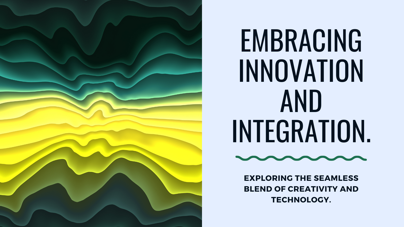
Pantone doesn't merely set the standard; it evolves with the times. Integrated workflow tools like PantoneLIVE and Pantone Studio empower designers to stay ahead of technological advancements and market trends. These tools enable designers to explore new printing techniques, experiment with innovative materials, and adapt to changing consumer preferences—all while maintaining color accuracy and relevance. By embracing innovation and integration, Pantone equips designers with the tools they need to push the boundaries of packaging design.
Trend Forecasting and Customization:
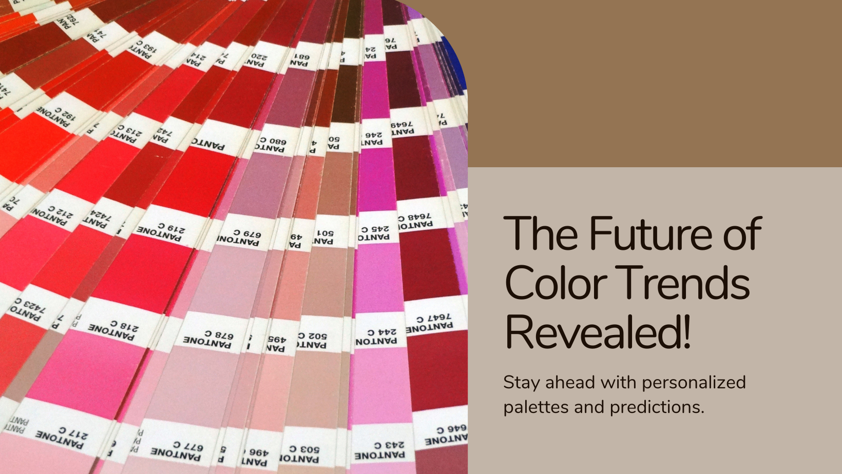
Design is as much about the future as it is about the present. The Pantone Color Institute™ leads the way in forecasting global color trends and offering customized color solutions to brands. By analyzing cultural influences, consumer behaviors, and socio-economic trends, the Color Institute provides invaluable insights into emerging color palettes and design directions. Whether it's predicting the next Color of the Year or advising on custom color development, Pantone enables brands to stay ahead of the curve and connect with consumers on a deeper level.
Bringing Design to Life:
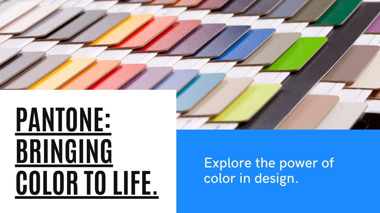
Ultimately, Pantone isn't just about colors; it's about bringing design to life. From textiles to beauty products, from interiors to industrial design, Pantone's influence permeates every aspect of the design landscape. Through collaborations and licensing partnerships, Pantone Lifestyle division celebrates the fusion of color and design in everyday products, making design accessible and aspirational for all. Whether it's a vibrant scarf or a sleek smartphone case, Pantone adds a touch of sophistication and style to every product it touches.
In conclusion, Pantone isn't just a color system; it's a cornerstone of modern design, especially in the realm of packaging. By providing a universal language of color, ensuring precision and consistency, fostering innovation and integration, forecasting trends, and bringing design to life, Pantone elevates packaging design to new heights. So, the next time you marvel at a beautifully designed package, remember, there's a good chance Pantone played a part in making it a reality.